


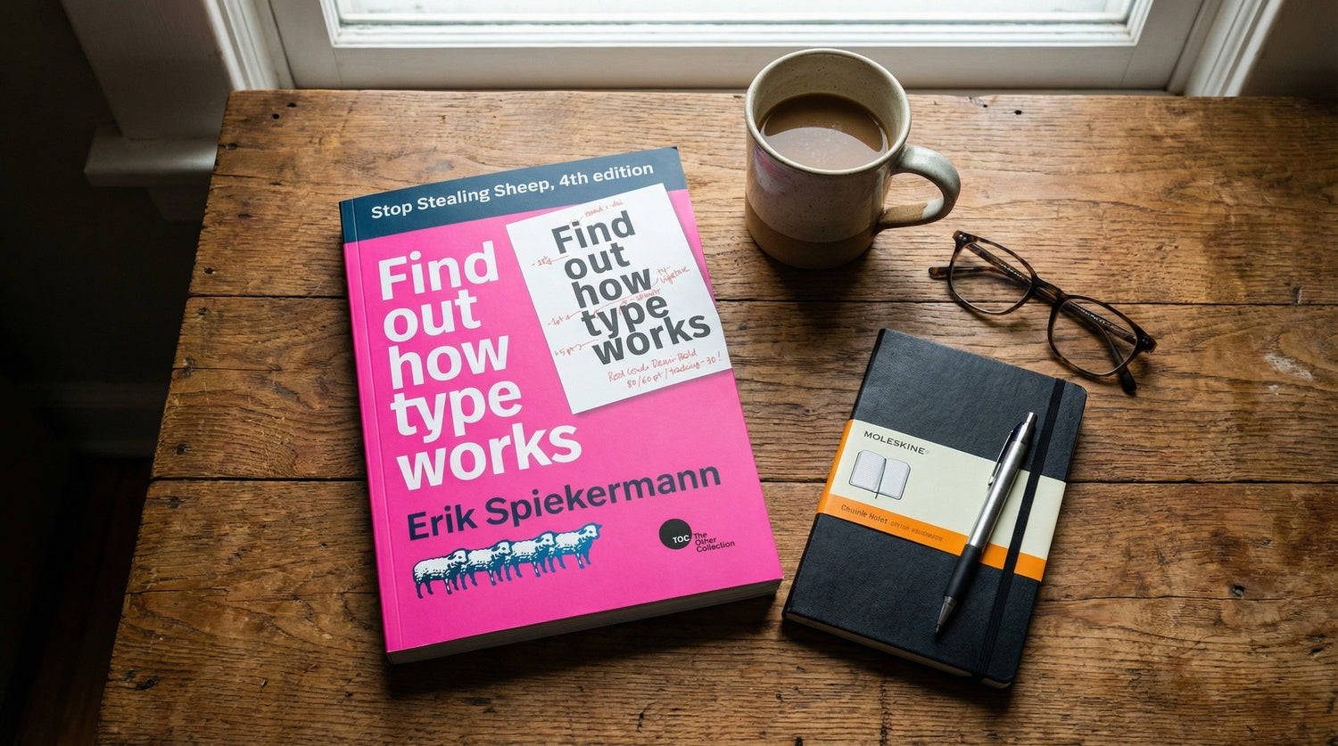
Let’s be real: most people think picking a font is just about finding something that looks “cool.” But if you’ve ever seen a legal contract in Comic Sans or a high-tech startup using a clunky typewriter font, you know that type carries a vibe long before anyone actually reads a single word. At inksie, we live for the intersection of tech and the "Beauty of the Raw," which is why I recently went back to the source: Stop Stealing Sheep & find out how type works by Erik Spiekermann.
This isn't just a design book; it’s a manual for human communication. Spiekermann, a legend who has designed type for everyone from The Economist to Bosch, treats letters not as static symbols, but as living entities integrated into society's moods and trends. If you're building a brand, a merch line, or a movement, you need to understand that your choice of type is your brand's real voice.
The Legend of the "Sheep Stealer"
First, we have to address the title. It’s a bit of an inside joke that has become a battle cry for typographers. The phrase originated with Frederic Goudy, a prolific American type designer. In 1936, while receiving an award, Goudy looked at the hand-lettered certificate which had been improperly letterspaced and famously remarked, "Anyone who would letterspace black letter would steal sheep."
In the design world, letterspacing (or tracking) refers to the uniform space between a string of characters. Blackletter (think Old English or Gothic script) was designed to be dense and "woven" together. When you pull those letters apart, you destroy their architectural integrity. Spiekermann’s book title modernizes this: "Anyone who would letterspace lower case would steal sheep." The lesson for us? Respect the logic of the forms. If you mess with the fundamentals of how a letter is built just to look "edgy," you aren't being creative you're just being sloppy.
Axiom #1: You Cannot NOT Communicate
One of the most profound takeaways from Spiekermann is his reliance on Paul Watzlawick’s first axiom of communication: "You cannot not communicate." Even a blank page communicates something usually a lack of ideas or a void. The moment you put a single letter on a t-shirt or a website, you are projecting a personality.
Think about your morning routine. You depend on type from the second you wake up. You don't read the word "Milk" on the carton every morning to know what's inside; you recognize the "face" of the brand. You look for the "S" and "P" on the salt and pepper shakers. In a world without type, you’d be as lost as a tourist in a country where they can't read the alphabet. Type provides the invisible infrastructure of our lives.
In branding, this means there is no such thing as a "neutral" font. Even Helvetica often cited as the ultimate neutral carries a specific, modern, corporate, and somewhat "safe" baggage. If you choose a font because it’s "default," you are communicating that your brand is default. At inksie, we hate default. We want the raw, the authentic, and the intentional.
The Wardrobe Theory: Dressing Your Message
Spiekermann uses a brilliant analogy that we use constantly at inksie: Type is a wardrobe. You wouldn’t wear a tuxedo to a backyard BBQ, and you wouldn't wear flip-flops to a board meeting (unless you're in Silicon Valley, but even that is a specific "costume").
When you choose a typeface, you are dressing your message. Here’s how we break down the "wardrobe" of type for your next project:
1. The Professional (The Bespoke Suit)
Serious money businesses banks, law firms, legacy brands often recall the era of copperplate engraving. This is when assets were embodied in elaborately printed certificates. These fonts are often high-contrast serifs. They feel sturdy, expensive, and established. Using a font like Equity (which Spiekermann actually used for the main text of his book) signals that you are an authority.
2. The Hand-Crafted (The Raw Denim)
In produce markets or meat shops, prices change daily. The signs are often handwritten because it's practical. This has created a psychological link between "handwritten" and "fresh" or "authentic." If your brand is about being handmade or organic, you want typefaces that betray the "traces of the hand." We love fonts with rough edges or irregular shapes because they feel human. They embody the "Beauty of the Raw."
3. The Technocratic (The Performance Gear)
High-tech applications demand a cool, precise look. This is the realm of the sans-serif. Fonts like FF Meta or interstate feel like they were machined rather than drawn. They are about efficiency, speed, and the future. If you’re launching an app or a tech-forward merch line, this is your lane.
The Anatomy of Readability: Why Your Eyes Get Tired
Spiekermann goes deep into the "how" of reading. Most people think we read letter-by-letter, but we don't. We read by recognizing the word-picture. Our eyes scan the top of the letters' x-heights. The brain assembles the "skyline" created by ascenders (the bits that go up, like in 'h' or 'd') and descenders (the bits that go down, like in 'p' or 'g').
This is why all-caps text is so much harder to read in long bursts it turns every word into a uniform rectangle, destroying the "skyline" that our brains use for quick identification. If you want people to actually read your brand story, use lowercase. If you want to shout a single word on a hoodie, use caps.
There is also the concept of typographic ergonomics. Just as a chair can be too high or a light too dim, type can be physically exhausting. If the space between lines (leading) is too tight, your eye will accidentally jump from the first line to the third. If the line length is too long, your eye gets "lost" trying to find the start of the next line. At inksie, we focus on these details so your custom designs don't just look good they feel right.
The Future is Fluid: Variable Fonts
The 4th edition of Stop Stealing Sheep introduces a game-changer: Variable Fonts. For decades, a "font" was a static file. If you wanted "Bold," "Italic," and "Thin," you needed three files. This made websites slow and design rigid.
A variable font is a single file that acts like a slider. You can change the weight, the width, and even the "optical size" (adjusting the thickness of lines based on how small the text is) on a continuous axis. This is the ultimate tool for the "Doer." It means your brand can be perfectly legible on a tiny smartphone screen and incredibly bold on a massive billboard using the exact same DNA. It saves bandwidth and pushes the boundaries of design flexibility.
The "Nondesigned" Look: Finding Beauty in the Basic
Sometimes, the most authentic thing you can do is go "nondesigned." Spiekermann points out that typefaces designed for technical constraints like Courier for typewriters or OCR-B for optical character recognition have a unique, honest charm. They don't try to be pretty; they try to be functional.
We see this a lot in "streetwear" and modern "brutalist" design. Taking a font that was meant for an invoice and putting it on a high-end hoodie creates a tension that feels raw and honest. It says, "I'm not trying to sell you a polished fantasy; I'm giving you the facts."
Stop Stealing Sheep: An inksie Call to Action
The takeaway for every creator, entrepreneur, and event organizer reading this is simple: Type is not a background element. It is the backbone of your brand.
When you sit down to create your next design in the inksie Customizer, don't just pick the first font that looks "cool." Ask yourself:
- What is the "wardrobe" for this message? Is it a suit or raw denim?
- Is the "skyline" of my words clear, or am I shouting in all caps?
- Am I using a "default" voice, or am I choosing something that reflects my unique brand DNA?
Spiekermann reminds us that "there is no bad type," only type used in the wrong context. Even the most hated fonts have a purpose (somewhere). Your job as a creator is to find the voice that matches your vision. Stop settling for the generic. Stop "stealing sheep" by ignoring the rules of good design.
The beauty is in the raw details. It’s in the way a letter 'g' loops or the way a serif anchors a word to the page. It’s the difference between a brand that is forgotten and a brand that leaves a mark.
Ready to find your brand's voice? Our customizer is packed with 1500+ fonts that help you avoid the "sheep-stealing" traps. Go build something authentic.
”Stop Stealing Sheep and find out how type works, 4th edition” (PDF, 23 Mb) is published and open to all under a Creative Commons license on Google Fonts.
About the Author: Mark Davies is the Head of Brand & Strategy at inksie. He’s spent a decade in e-commerce and has a personal vendetta against corporate fluff and poorly kerned logos. When he isn't guarding "The Beauty of the Raw," he's likely looking at 15th-century Venetian type specimens and wondering why we ever tried to improve on them.
